- Home
- Publications and statistics
- Publications
- How firms are adapting to the lockdown: ...
Post n°160. Using the additional comments collected at the end of the monthly business survey for March, we used text mining to construct indicators of how firms are adapting to the lockdown (short-time work, teleworking, etc.). This information provides an overview of the way industry-specific organisational structures are being adapted, and both confirms and expands on the findings of the survey.

Source: The Banque de France's monthly business survey (MBS).
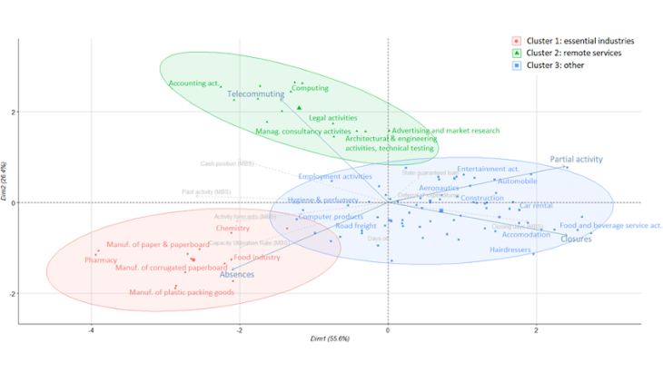
Note: Cluster 1 has a low rate of business closures and high rate of absences; cluster 2 has higher recourse to teleworking and a high rate of short-time working, and the last cluster has a high rate of closures and has suffered a sharp decline in activity.
In addition to the usual closed questions, the Monthly Business Survey (MBS) for the manufacturing, services and construction industries includes an additional comments section in which respondents can highlight any issues they felt were significant over the month in question. The section proved to be a particularly abundant source of information in March. It provided unique data for analysing how industries are adapting their organisational structures to the lockdown, which we exploit in this blog.
The comments point to seven main themes associated with the lockdown…
Close to 6,500 usable comments were collected in March. These referred repeatedly to seven main themes linked to the lockdown: use of short-time work, teleworking and paid leave, employee absences (sick leave, including for childcare), partial or full closures, deferrals of charges (social security contributions, tax payments, loan repayments, etc.), and requests for state-guaranteed loans (SGLs).
To identify all the comments linked to a given theme, we defined a list of keywords specific to that topic, then checked whether any of these words were present in the comments, while controlling for negations and homonyms (a so-called dictionary-based text mining approach).
... which can be validated through an external comparison
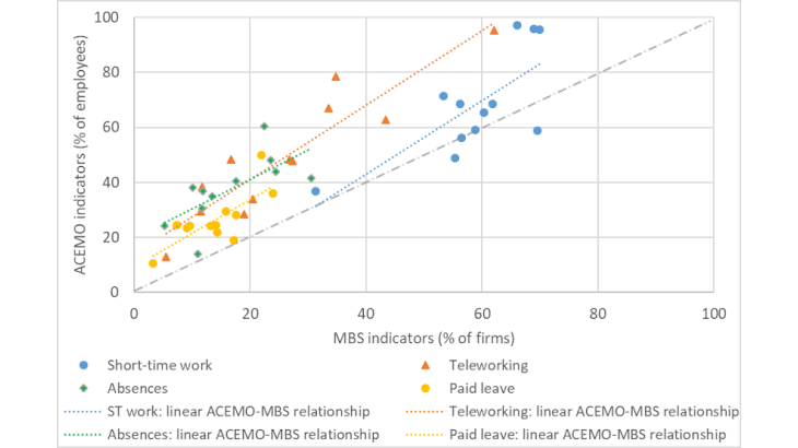
To assess the quality of our indicators, we cross-checked four of them against those obtained from the Survey of Labour Activity and Working Conditions conducted by Dares from 1 to 13 April (ACEMO Covid-19): use of short-time work, teleworking, paid leave and other absences. In Chart 2, each point represents one of the aggregated industries from the French classification of activities (NAF, 17 industries). The levels observed in the ACEMO (y-axis) are almost systematically higher than those of our indicators (x-axis). Leaving aside the methodological differences (the ACEMO figures are given as a percentage of employees, and not as a percentage of firms, and the survey scope is broader than for the MBS), this under-estimation most likely stems from the fact that our indicator only captures spontaneous answers from business managers.
However, the order of ranking for the industries, from the most concerned to the least concerned, is the same for both measures, which confirms the quality of the industry comparisons.

Source: MBS (Banque de France) and ACEMO Covid (Dares) surveys
Note: With the exception of the indicator for short-time work, all ACEMO indicators show the percentage of employees working for a firm in which at least 10% of staff are concerned.
Government aid schemes and firms’ organisational responses: a network with weak links
For a more in-depth analysis, we calculated the proportion of firms concerned by each theme in all industries for which we had data on at least 30 individual firms. The results obtained concerned 98 industries, of which 25 were aggregated (EMC classification), 27 semi-aggregated (NAF88) and 46 detailed (NAF700). Using these data, we first analysed the network of two-by-two correlations (indicator of the nature and intensity of the link) between the seven themes.
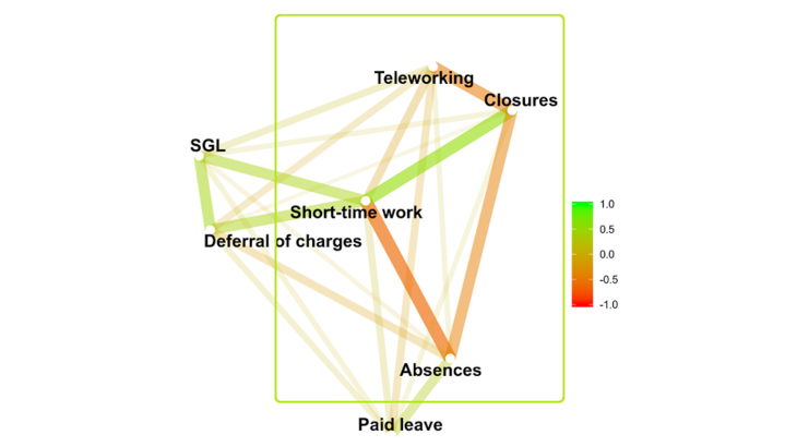
This network (Chart 3) is structured into two blocks with a common central node. The block on the left shows themes relating to government aid schemes (short-time work, deferral of charges and state-guaranteed loans), all of which display a positive two-by-two correlation. The block on the right shows themes relating to firms’ organisational response: site closures and short-time work, which are positively correlated with each other but negatively correlated with teleworking and employee absences (the correlation between paid leave and the rest of the network is weak). The unifying and common point between the two blocks, shown in the centre, is short-time work, which is seen as a form of government aid in the left-hand block, and as an indicator of underemployment in the right-hand block.
The weakness of the links between the two other government aid schemes and the activity variables could stem from the fact that these measures had only been rolled out to a limited extent by end-March: only 11% of comments referred to requests for state-guaranteed loans and 25% to requests for deferrals of charges, whereas 59% cited the use of short-time work.

Source: The Banque de France's monthly business survey (MBS).
Note: The intensity of the correlation between two points is indicated by their proximity, and by the thickness and darkness of the connecting line. Thus, use of short-time work is strongly positively correlated with site closures (green link) and strongly negatively correlated with employee absences (red link).
The industry landscape breaks down into three main clusters
How are the different organisational responses used by firms positioned within this network? To answer this question, we grouped the industries together using hierarchical clustering on the four main variables in the right-hand block in the network (framed in Chart 3). In this way, we identified three main industry categories, each displaying similar organisational choices or constraints.
We then presented these clusters stylistically in the first factorial plane of a principal component analysis carried out using the same variables. The horizontal axis shows the level of activity, in descending order from left to right: it distinguishes between industries with a high rate of closures and short-time work (right-hand side, cluster 3), and those that have been able to maintain their activity, either through teleworking or on-site, but with a certain amount of employee absence (left-hand side of the axis, clusters 1 and 2). The vertical axis compares the two modes of activity: mainly on-site (at the bottom, cluster 1), or mainly teleworking (top, cluster 2).

Source: The Banque de France's monthly business survey (MBS).
Note: The first factorial plane of the principal component analysis reproduces 82% of the total dispersion of the cloud. The proximity between two industries reflects the similarity between them regarding the 4 themes: short-time work, teleworking, closures and other absences.
This factorial plane breakdown reveals three industry clusters. The bottom left-hand corner contains industries deemed essential during the lockdown (13 industries): pharmaceuticals, agri-food (excluding industrial baked goods), chemicals (excluding perfumes and personal care products) and, fuelled by the former, paper, cardboard and plastic packaging. The top left-hand area shows services requiring little or no physical contact, and which have made massive use of teleworking (14 industries): IT, legal and accounting services, management consultancy, and, to a lesser extent, architectural, engineering and technical activities, and advertising and market research.
The area on the centre-right contains the vast majority (71 industries) of activities that have been unable to continue their operations on site, and which are difficult to carry out via teleworking. In this larger cluster, the individual industries can also be ranked according to the severity of the impact, from the least affected on the left to the worst affected on the right. The centre of the chart shows activities less severely affected by the lockdown, and that are closely linked to cluster 1 (IT products, road freight, perfumes and personal care products) or cluster 2 (temporary work). The area immediately to the right of the axis shows the remaining manufacturing industries, which have been more severely affected (especially motor vehicles, aeronautics), construction and the performing arts. The far right of the chart shows those industries where activity has been worst affected: personal services, hotels, restaurants, hairdressers and car rentals.
Chart 1 reveals the link between the different forms of organisation adopted by industries and the results of the business summary published at the start of April. It shows that differences in organisation from one cluster to another translate into differences in activity and cash-flow levels.
This is the benefit of carrying out a text mining on the additional comments section: it expands on the standard economic analysis by providing new information, at a granular industry level, on the changes firms have made to adapt to the lockdown.
Updated on the 25th of July 2024